I’m really not one for the trend of “I redesigned whatever app and fixed it”.
Most of the time these amount to pretty redesigns of existing products without any understanding of the business motivations, observed user problems or technical restrictions. It’s easy (but fun) to design something from the outside in a vacuum of total ignorance.
Now that being said, I have an itch that needs scratching.
I love my Fairphone. It’s miles ahead on building an ethical supply chain, challenges norms around repairability and it performs well honestly. It’s also pretty free of pre-loaded junk, shipping fairly close to stock Android. That’s great, love that, apart from Android 14’s power menu is giving me grief. Enough grief to make a short post about it on my infrequently read website. So, big deal.
Turning your phone off isn’t something you do with much concentration. As a ‘job-to-be-done’ it’s not big nor sexy. I’m usually at the cinema when I turn my phone off having been reminded to do so by an overbearing voice over. I’ll be doing so in the dark, whilst I’m sat down, with the phone only half out of my pocket, with the other hand clutching popcorn. I hold down the power and get this screen…
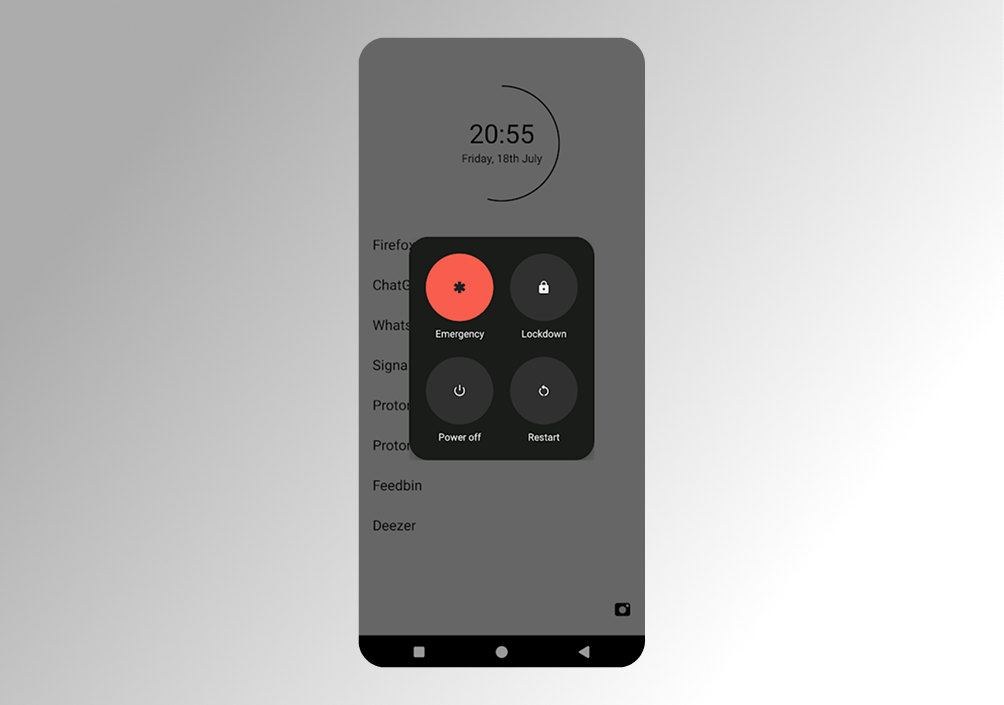 My phone’s power-off UI with the emergency button the most prominent by far
You go for the RED right?! The red screaming “touch me I’m the one you want”. Off = red.
But it’s not is it. That’s the emergency button, which I thankfully almost never actually want.
The one you want is one of three similarly grey, small, icon-y, close-by buttons. Two of them you need even less often than the lesser-used power button. Now and then I need to restart, fine, but I actually don’t know what ‘Lockdown’ does (Ok, I tried it. It, umm, locks your phone 🤷♂️).
Here’s where I’m at…
-
Unvalidated user assumption #1: The action users want to take most frequently from here is “Power off”.
-
Unvalidated user assumption #2: The action users want to take least frequently from here is “Emergency”.
-
Unvalidated user assumption #4: Users semi-frequently accidentally press the big red one.
-
Unvalidated user assumption #4: On the odd occasion there is an emergency, you’re going to be a million times more thankful that it was big and red than you’ll ever be annoyed you nearly pressed it whilst about to watch a film. So it is still important.
It’s an interesting one. Generally we make the most commonly used button the most prominent. In this case there’s a tension between the most used and potentially the most important.
Anyway, I couldn’t resist could I…
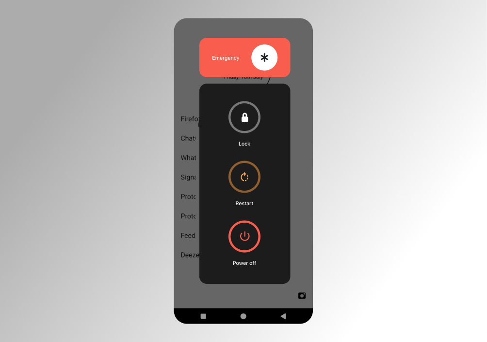 My super-duper redesigned UI with clearer hierarchy of importance and separation of concern
Unsolicited designer tweak #1: Give the emergency button its own space
The Law of Common Region states that ‘elements tend to be perceived into groups if they are sharing an area with a clearly defined boundary.’
Three of these buttons are related to system states your phone might be in: off, restarting, or locked. The emergency button has a totally different purpose. Shifting it visually away keeps its prominence whilst separating the concerns. Different button styles further help differentiate.
Unsolicited designer tweak #2: Reorder elements and introduce visual hierarchy
Serial Position Effect states that ‘users have a propensity to best remember the first and last items in a series.’
In the real design, other than the red, it’s pretty unopinionated on their order of importance. I’m opinionated (obviously), so here’s my hierarchy based on my unvalidated user assumptions. If I were right, then the first and last items are probably the ones users will want the best memory of.
The “Power off”, being the most commonly used, is easiest to tap with a thumb and furthest from the one you most don’t want to touch by accident.
Unsolicited designer tweak #3: Further differentiate buttons
Adding some different colours can help further differentiate. Making the icons larger helps at a glance too. Crude, but worth it.
This might not be an improvement. I haven’t tested it. I have no idea how big a problem this is. I have no idea how many lives have been saved by the current prominence of the “Emergency” button.
There are however, tried and tested UI patterns grounded in well-established UX principles - themselves rooted in user perception and psychology. More often than not, applying these is a good bet.
At the very least, this would help alleviate my specific, trivial, maybe even petty, cinema grief.